
Menomena: Friend and Foe from Mr Truffle on Vimeo.
MY BLOG HAS MOVED!
You should be automatically redirected in a few seconds. If not, visit
http://supakid.wordpress.com
and update your bookmarks! See ya there!!! :D

Menomena: Friend and Foe from Mr Truffle on Vimeo.


What? My work? My work will always be about you and about me!... about anarchists, fortune-tellers, fleeing kings blasphemers and mutineers. Also about fire starters, and threatened witches. And luminaries and other artists. Thieves, (those poets), biologists and sexologists. First-grade teachers married with journalists and the priests that became atheists. Poets and wall painters, but not as much as it is about tall dwarves, black cats, color visionaries and survivors from shipwrecks. People with odd limps, dust in road humps, Light-bulbs changers, professional vagabonds, perfect stammers, and spontaneous mutes. It is about looking and seeing and seeing and looking (for). It is about being secretly, secretly happy.


"Doug was born and raised in Toronto and moved to New York in 1968. He had done some fashion illustration as well as working editorially in the Toronto area. When he moved to New York he explained that he was coming from the drawing-based expressive illustration look of Bernie Fuchs and Jimmy Hill, a style that would find its apotheosis in Bob Peak. Hill took Doug under his wing, introducing him to clients and he quickly found work, but eventually tired of his style and wanted to experiment with the look for which he later became famous. In 1970 he took the summer off and developed his painterly approach with two assignments: A Society of Illustrators Call of Entries poster and a series of football diagrams for Sports Illustrated.
Doug, and Charles White III, with whom he a shared a studio (featuring astro turf, patio furniture and a cafe umbrella) in the early 1970s, were instrumental (following after Pushpin) in shifting illustration from being about literal or expressive representation into something more free form and improvisational which was in sync with pop culture, i.e. Lucy In The Sky With Diamonds, Eugene Ionesco and nostalgia. But if Pushpin was design-centric and, to a degree, polite, Doug’s work, like Charlie’s, was image-based, intent on blasting your eyeballs with vivid colors and forms, pushing the medium along so it could compete with other pop media of the time. He seemed to have cracked a way of taking the work of earlier graphic drawers such as Hohlwein and Bernhard and modernizing it. Almost overnight Doug’s new style was a huge success and he was inundated with commissions from Life Magazine, Esquire, Time, advertising accounts and record sleeves.
Doug’s trademark was to slam hard highlights on top of a more traditional and considered image, so it kind of fucked with your head. Usually illustrators that adopted a stronger graphic style weren’t always the best draftsmen, but Doug obviously could draw and paint. Yet he still felt compelled to step on the accelerator and keep throwing all this STUFF on top of a perfectly fine picture until he wound up with these odd hybrid images. Upon initial glance the paintings seem quite traditional, but the longer you study an image, it’s as if you’re in the early stages of a Hollywood dream sequence, where everything starts to wiggle and blur a little bit. This beautiful painting of a tennis player is a perfect example of his peculiar vision. It’s very difficult to ascertain what order it’s been painted in. I was always impressed by what appeared to be a very laissez-faire attitude he had towards plopping a lot of casual brushwork onto a beautifully painted and considered and - basically completed illustration. This marriage of the planned with the improvised was unique to Doug.
Illustration is a fickle beast, and Doug stayed busy into the early 1980s, but the industry changed and it became a hell of a lot less fun. Art directors were disinclined to allow him to come up with his own solutions, and increasingly prescriptive. But Doug had a side gig going that would prove to be his fire escape out of illustration. In 1974 he was hired to create an image for a a theatrical production of Leonard Bernstein’s Candide in Brooklyn. He continued working with this production company throughout the decade, eventually becoming a partner, and then forming Dodger Theatricals, which produced Broadway and Off-Broadway shows, for which Doug designed posters, print advertising, and sets, including Ain’t Misbehavin’, The Big River and Tommy. A funny aside: Early on Doug needed to get some typesetting done for a newspaper ad, and realized he didn’t possess the proper skills to mark up the instructions for the typesetter, so he called on his pal Herb Lubalin for advice. Herb looked at his typewritten text, mumbled a few words and spec’d the type for him. Needless to say Doug’s theatrical phase has been hugely successful and has long since allowed him to sneak away from the illustration work that had become a bore. Some of his last “straight” illustration jobs were a remarkable series of album covers for Judas Priest in the 1980s.
One perk of ruthlessly ransacking an artist’s studio is looking at the originals to see, well, just how tough these guys really were. Doug is tough. His originals are just perfect. No repairs or signs of hesitancy are to be found anywhere. He showed us a color rough done for a project which was painted at quite a small size, then enlarged for the final illustration, the base painting was executed in mixtures of airbrushed and flat brush work, which are then studied for a while before finally finishing off with additional layers of dauby hand painting and spray effects. The guy was no slouch in the work-until-you-drop department.
Doug Johnson interview from norman hathaway on Vimeo.
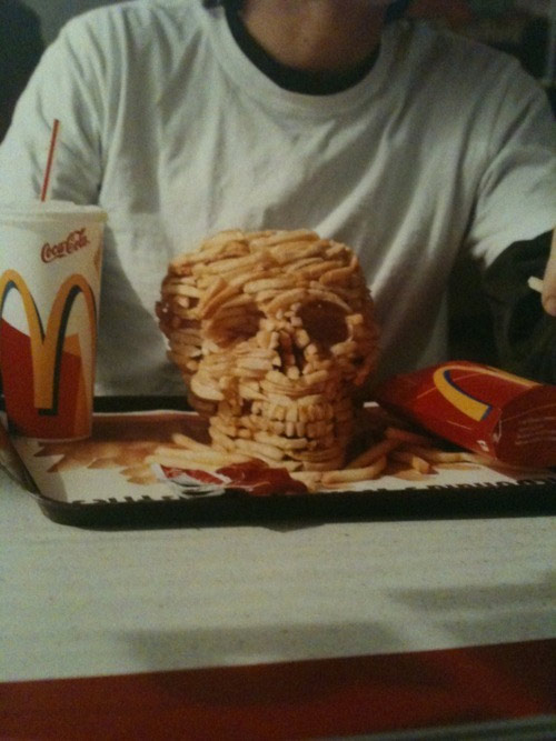
Cookies by Douglas Adams (author: "Hitchhiker's Guide to the Galaxy")
This actually did happen to a real person, and the real person was me. I had gone to catch a train. This was April 1976, in Cambridge, U.K. I was a bit early for the train. I'd gotten the time of the train wrong.
I went to get myself a newspaper to do the crossword, and a cup of coffee and a packet of cookies. I went and sat at a table.
I want you to picture the scene. It's very important that you get this very clear in your mind.
Here's the table, newspaper, cup of coffee, packet of cookies. There's a guy sitting opposite me, perfectly ordinary-looking guy wearing a business suit, carrying a briefcase.
It didn't look like he was going to do anything weird. What he did was this: he suddenly leaned across, picked up the packet of cookies, tore it open, took one out, and ate it.
Now this, I have to say, is the sort of thing the British are very bad at dealing with. There's nothing in our background, upbringing, or education that teaches you how to deal with someone who in broad daylight has just stolen your cookies.
You know what would happen if this had been South Central Los Angeles. There would have very quickly been gunfire, helicopters coming in, CNN, you know. . . But in the end, I did what any red-blooded Englishman would do: I ignored it. And I stared at the newspaper, took a sip of coffee, tried to do a clue in the newspaper, couldn't do anything, and thought, what am I going to do?
In the end I thought, nothing for it, I'll just have to go for it, and I tried very hard not to notice the fact that the packet was already mysteriously opened. I took out a cookie for myself. I thought, that settled him. But it hadn't because a moment or two later he did it again. He took another cookie.
Having not mentioned it the first time, it was somehow even harder to raise the subject the second time around. "Excuse me, I couldn't help but notice . . ." I mean, it doesn't really work.
We went through the whole packet like this. When I say the whole packet, I mean there were only about eight cookies, but it felt like a lifetime. He took one, I took one, he took one, I took one. Finally, when we got to the end, he stood up and walked away.
Well, we exchanged meaningful looks, then he walked away, and I breathed a sigh of relief and sat back. A moment or two later the train was coming in, so I tossed back the rest of my coffee, stood up, picked up the newspaper, and underneath the newspaper were my cookies.
The thing I like particularly about this story is the sensation that somewhere in England there has been wandering around for the last quarter-century a perfectly ordinary guy who's had the same exact story, only he doesn't have the punch line.
(Excerpted from "The Salmon of Doubt: Hitchhiking the Galaxy One Last Time" by Douglas Adams)

"Hi, I'm an illustrator based in Los Angeles. I was educated at Parsons in New York, and am now back on the west/best coast, enjoying copious amounts of excellent Mexican food and LA's characteristic non-weather...


...So far I've drawn pictures for Bitch Magazine, Bust Magazine, Radical Teacher, New City Chicago, Time Out New York, The Metro Daily Newspaper, Village Voice Media, and Wellen Surf, and I occasionally exhibit"


