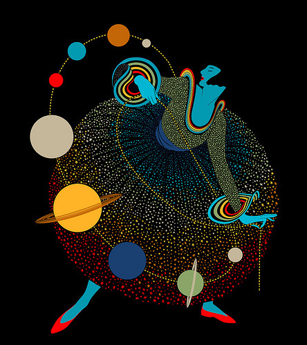
Exquisite execution, great colour scheme and incredible taste was part of what Mathew Dupuis combined when he designed Miss Universe.
“This design is a re-imagining of Vanity Fair cover from the early 1900’s. The original image featured a woman in a red and white polka-a-dot dress strangely twirling and manipulating a piece of rope. I’ve always loved the original designs balance of simplicity and complexity but also wondered what it would look like if it was outer-space themed.”

No comments:
Post a Comment